# input
输入框。该组件是原生组件,使用时请注意相关限制
| 属性 | 类型 | 默认值 | 必填 | 说明 |
|---|---|---|---|---|
| value | string | 是 | 输入框的初始内容 | |
| type | string | text | 否 | input 的类型 |
| password | boolean | false | 否 | 是否是密码类型 |
| placeholder | string | 是 | 输入框为空时占位符 | |
| placeholder-style | string | 是 | 指定 placeholder 的样式 | |
| placeholder-class | string | input-placeholder | 否 | 指定 placeholder 的样式类 |
| disabled | boolean | false | 否 | 是否禁用 |
| maxlength | number | 140 | 否 | 最大输入长度,设置为 -1 的时候不限制最大长度 |
| cursor-spacing | number | 0 | 否 | 指定光标与键盘的距离,取 input 距离底部的距离和 cursor-spacing 指定的距离的最小值作为光标与键盘的距离 |
| focus | boolean | false | 否 | 获取焦点 |
| confirm-type | string | done | 否 | 设置键盘右下角按钮的文字,仅在 type='text'时生效 |
| confirm-hold | boolean | false | 否 | 点击键盘右下角按钮时是否保持键盘不收起 |
| cursor | number | 是 | 指定 focus 时的光标位置 | |
| selection-start | number | -1 | 否 | 光标起始位置,自动聚集时有效,需与 selection-end 搭配使用 |
| selection-end | number | -1 | 否 | 光标结束位置,自动聚集时有效,需与 selection-start 搭配使用 |
| adjust-position | boolean | true | 否 | 键盘弹起时,是否自动上推页面 |
| bindinput | eventhandle | 是 | 键盘输入时触发,event.detail = {value, cursor},处理函数可以直接 return 一个字符串,将替换输入框的内容。 | |
| bindfocus | eventhandle | 是 | 输入框聚焦时触发,event.detail = {value: value} | |
| bindblur | eventhandle | 是 | 输入框失去焦点时触发,event.detail = {value: value} | |
| bindconfirm | eventhandle | 是 | 点击完成按钮时触发,event.detail = {value: value} |
type 的合法值
| 值 | 说明 |
|---|---|
| text | 文本输入键盘 |
| number | 数字输入键盘 |
| idcard | 身份证输入键盘 |
| digit | 带小数点的数字键盘 |
confirm-type 的合法值
| 值 | 说明 |
|---|---|
| send | 右下角按钮为“发送” |
| search | 右下角按钮为“搜索” |
| next | 右下角按钮为“下一个” |
| go | 右下角按钮为“前往” |
| done | 右下角按钮为“完成” |
# Bug & Tip
- confirm-type 的最终表现与手机输入法本身的实现有关,部分系统输入法和第三方输入法可能不支持或不完全支持
- input 组件是一个原生组件,字体是系统字体,所以无法设置 font-family
- 在 input 聚焦期间,避免使用 css 动画
# 使用效果
# 示例代码
<!--input.qxml-->
<view class="section">
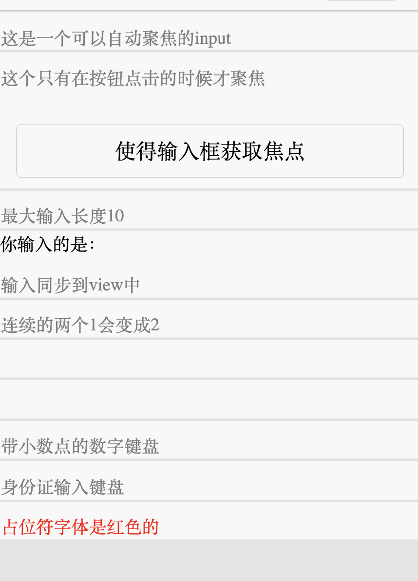
<input placeholder="这是一个可以自动聚焦的input" auto-focus />
</view>
<view class="section">
<input placeholder="这个只有在按钮点击的时候才聚焦" focus="{{focus}}" />
<view class="btn-area">
<button bindtap="bindButtonTap">使得输入框获取焦点</button>
</view>
</view>
<view class="section">
<input maxlength="10" placeholder="最大输入长度10" />
</view>
<view class="section">
<view class="section__title">你输入的是:{{inputValue}}</view>
<input bindinput="bindKeyInput" placeholder="输入同步到view中" />
</view>
<view class="section">
<input bindinput="bindReplaceInput" placeholder="连续的两个1会变成2" />
</view>
<view class="section">
<input password type="number" />
</view>
<view class="section">
<input password type="text" />
</view>
<view class="section">
<input type="digit" placeholder="带小数点的数字键盘" />
</view>
<view class="section">
<input type="idcard" placeholder="身份证输入键盘" />
</view>
<view class="section">
<input placeholder-style="color:red" placeholder="占位符字体是红色的" />
</view>
1
2
3
4
5
6
7
8
9
10
11
12
13
14
15
16
17
18
19
20
21
22
23
24
25
26
27
28
29
30
31
32
33
34
35
2
3
4
5
6
7
8
9
10
11
12
13
14
15
16
17
18
19
20
21
22
23
24
25
26
27
28
29
30
31
32
33
34
35
//input.js
Page({
  data: {
    focus: false,
    inputValue: ''
  },
  bindButtonTap: function() {
    this.setData({
      focus: true
    })
  },
  bindKeyInput: function(e) {
    this.setData({
      inputValue: e.detail.value
    })
  },
  bindReplaceInput: function(e) {
    var value = e.detail.value
    var pos = e.detail.cursor
    if (pos != -1) {
      //光标在中间
      var left = e.detail.value.slice(0, pos)
      //计算光标的位置
      pos = left.replace(/11/g, '2').length
    }

    //直接返回对象,可以对输入进行过滤处理,同时可以控制光标的位置
    return {
      value: value.replace(/11/g, '2'),
      cursor: pos
    }

    //或者直接返回字符串,光标在最后边
    //return value.replace(/11/g,'2'),
  }
})
1
2
3
4
5
6
7
8
9
10
11
12
13
14
15
16
17
18
19
20
21
22
23
24
25
26
27
28
29
30
31
32
33
34
35
36
2
3
4
5
6
7
8
9
10
11
12
13
14
15
16
17
18
19
20
21
22
23
24
25
26
27
28
29
30
31
32
33
34
35
36
input {
  margin-top: 10px;
}

.section {
  border: 1px solid #e0e0e0;
}
1
2
3
4
5
6
7
2
3
4
5
6
7
←
→
在线客服