# progress
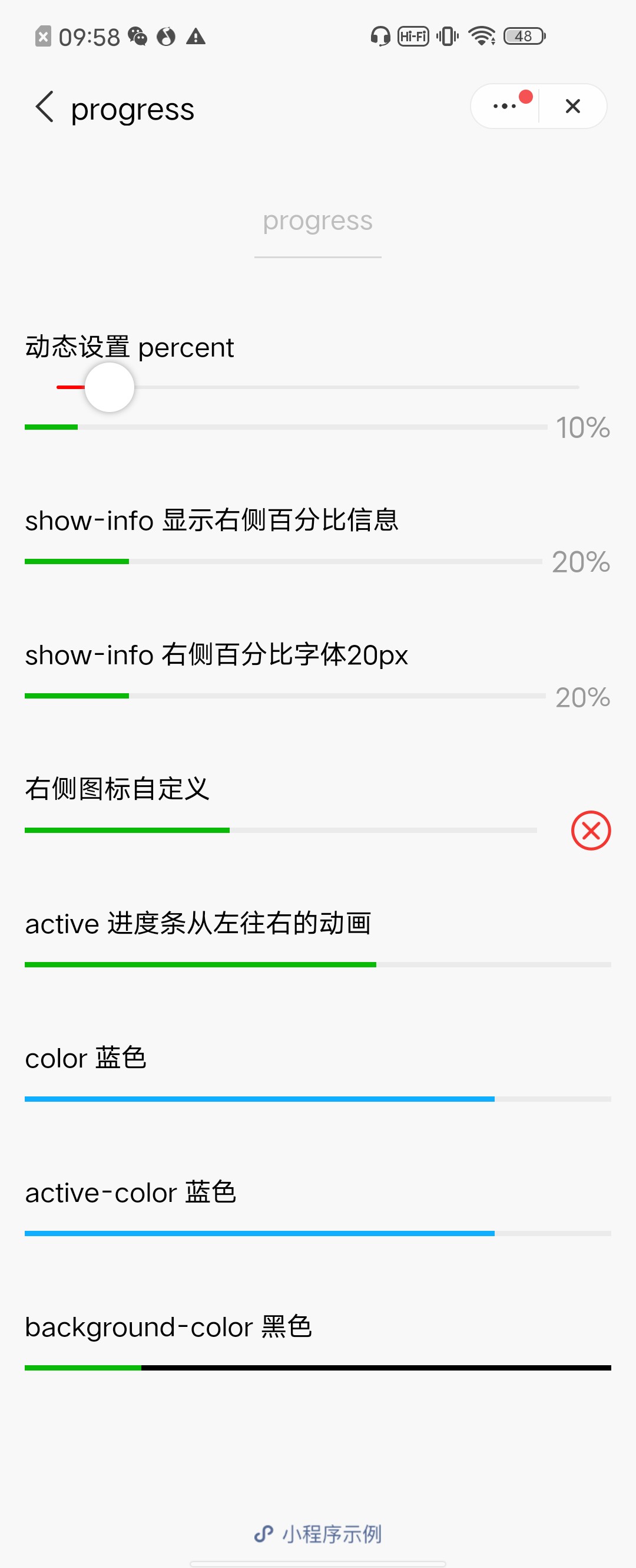
进度条。组件的默认属性长度单位为 px,支持传入单位(rpx/px)。
| 属性 | 类型 | 默认值 | 必填 | 说明 |
|---|---|---|---|---|
| percent | number | 否 | 0~100 的百分比 | |
| show-info | boolean | false | 否 | 在进度条右侧显示百分比 |
| border-radius | number/string | 0 | 否 | 圆角大小 |
| font-size | number/string | 16 | 否 | 右侧百分比字体大小 |
| stroke-width | number/string | 6 | 否 | 进度条线的宽度 |
| color | string | #09BB07 | 否 | 进度条颜色(请使用 activeColor) |
| activeColor | string | #09BB07 | 否 | 已选择的进度条的颜色 |
| backgroundColor | string | #EBEBEB | 否 | 未选择的进度条的颜色 |
| active | boolean | false | 否 | 进度条从左往右的动画 |
| active-mode | string | backwards | 否 | backwards: 动画从头播;forwards:动画从上次结束点接着播 |
| bindactiveend | eventhandle | 否 | 动画完成事件 |
# 使用效果
# 示例代码
<progress percent="20" show-info />
<progress percent="40" stroke-width="12" />
<progress percent="60" color="pink" />
<progress percent="80" active />
1
2
3
4
2
3
4
←
→
在线客服